The Pittsburgh Tribune is a reputable news website covering Pittsburgh and its surrounding area. They have a number of different sites but this project focuses on the redesign of their local website.
Role
UX/UI Designer
Industry
News / Media
Duration
6 months
Identify
Before jumping into the research and designs we had to lay out some groundwork. We wanted to have an understanding of the problem we were facing and why.
Problem
As a local news website we cannot provide the most exciting and updated news at all times. User engagement has declined, with decreases in returning visitors and average session duration, alongside an increase in bounce rate.
The Plan
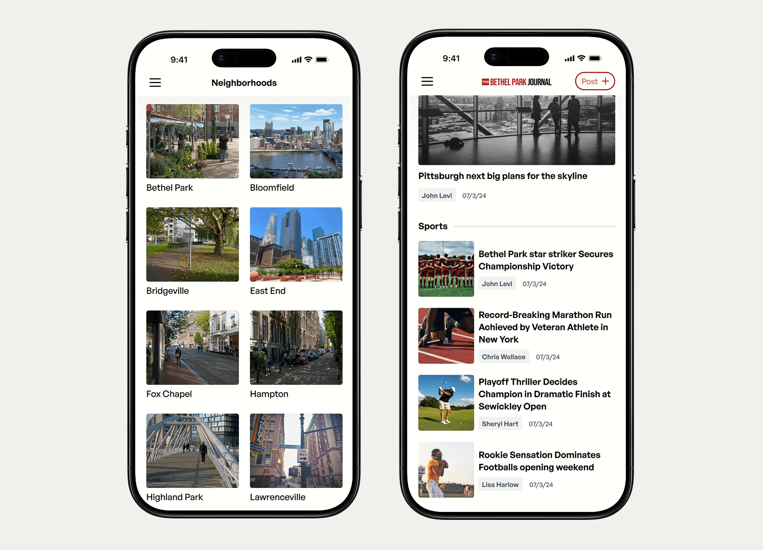
Redesign the local news platform to drive engagement and foster a strong sense of community. With personalized content and actionable features, create a platform where neighbors can share and stay informed on relevant news.
Research
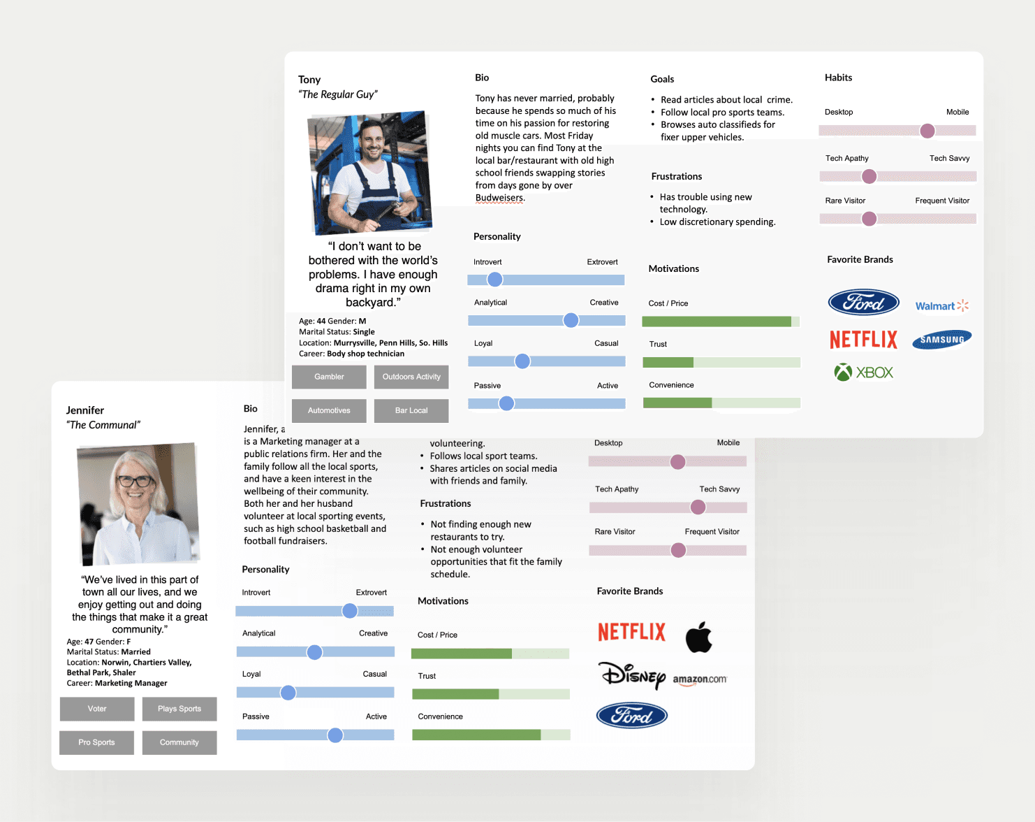
Once we understood our problem we began researching. We conducted academic research, user research and competitive analysis. Some tools we used include Google Analytics, Chat Gpt, and Google Scholar, and Useberry.
Findings
UGC is daunting
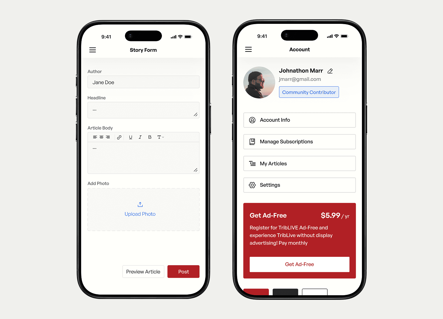
Asking users to write a full article is a lot. How can we make it as easy as possible.
Simplify and Guide
Design for an older, less tech-savvy audience by simplifying the layout and reducing distractions.


Ideate & Test
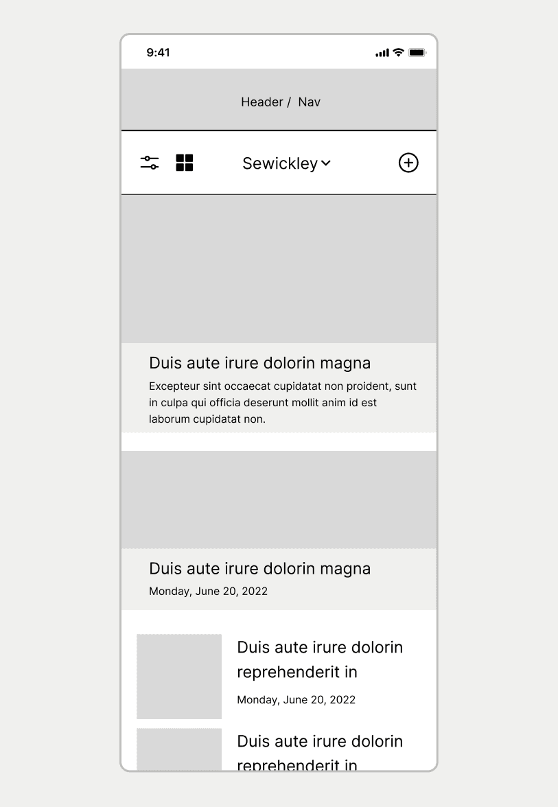
Taking into account our research findings we designed our first wireframes. We then tested them by having users complete tasks, answer questions, etc.
Test Findings
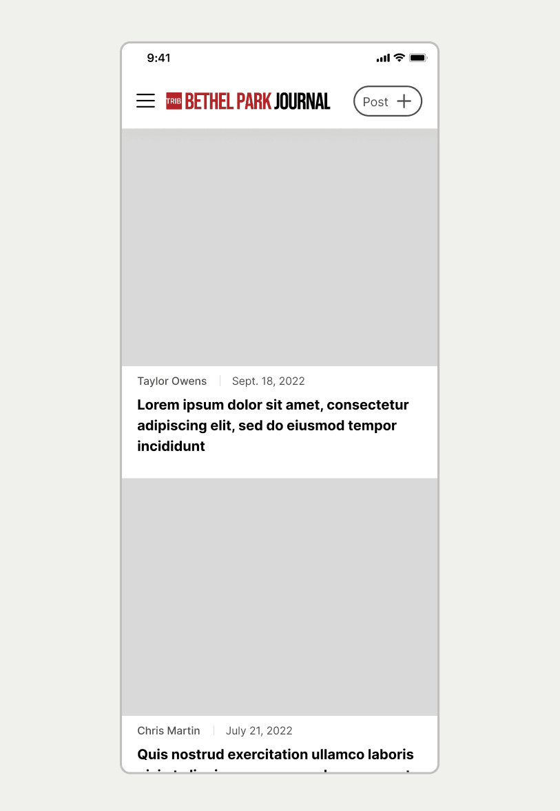
Navigation is confusing
“Post” button is getting skipped over
User bounce rate on "write article" page is high
Changes
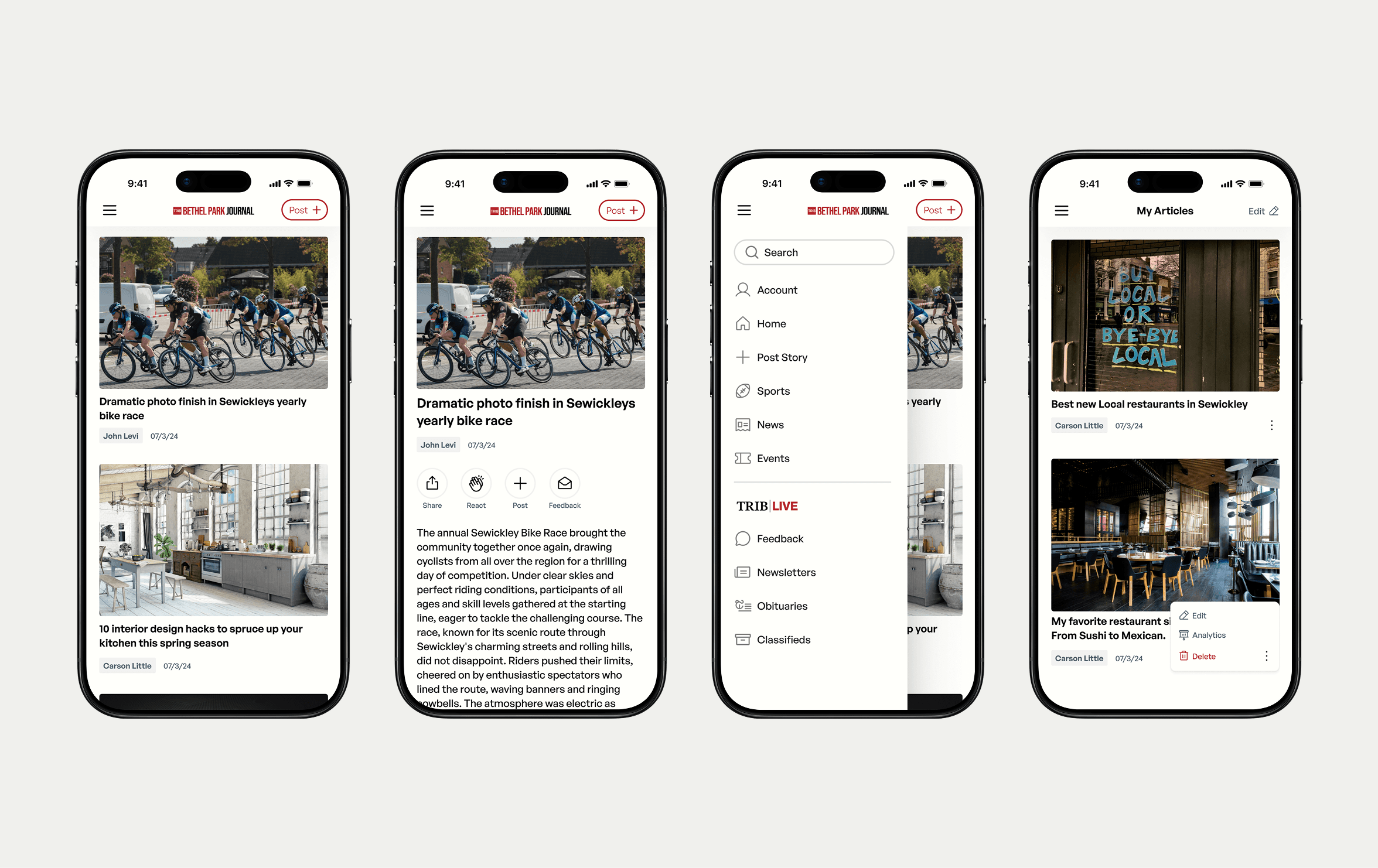
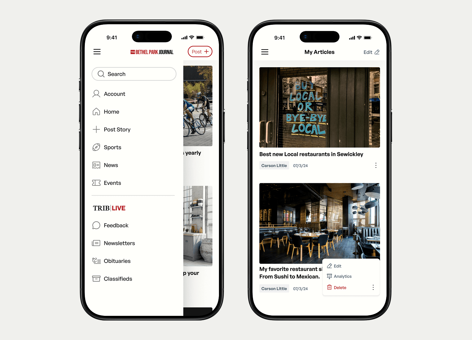
Simplify nav bar
Strengthen “Post” button
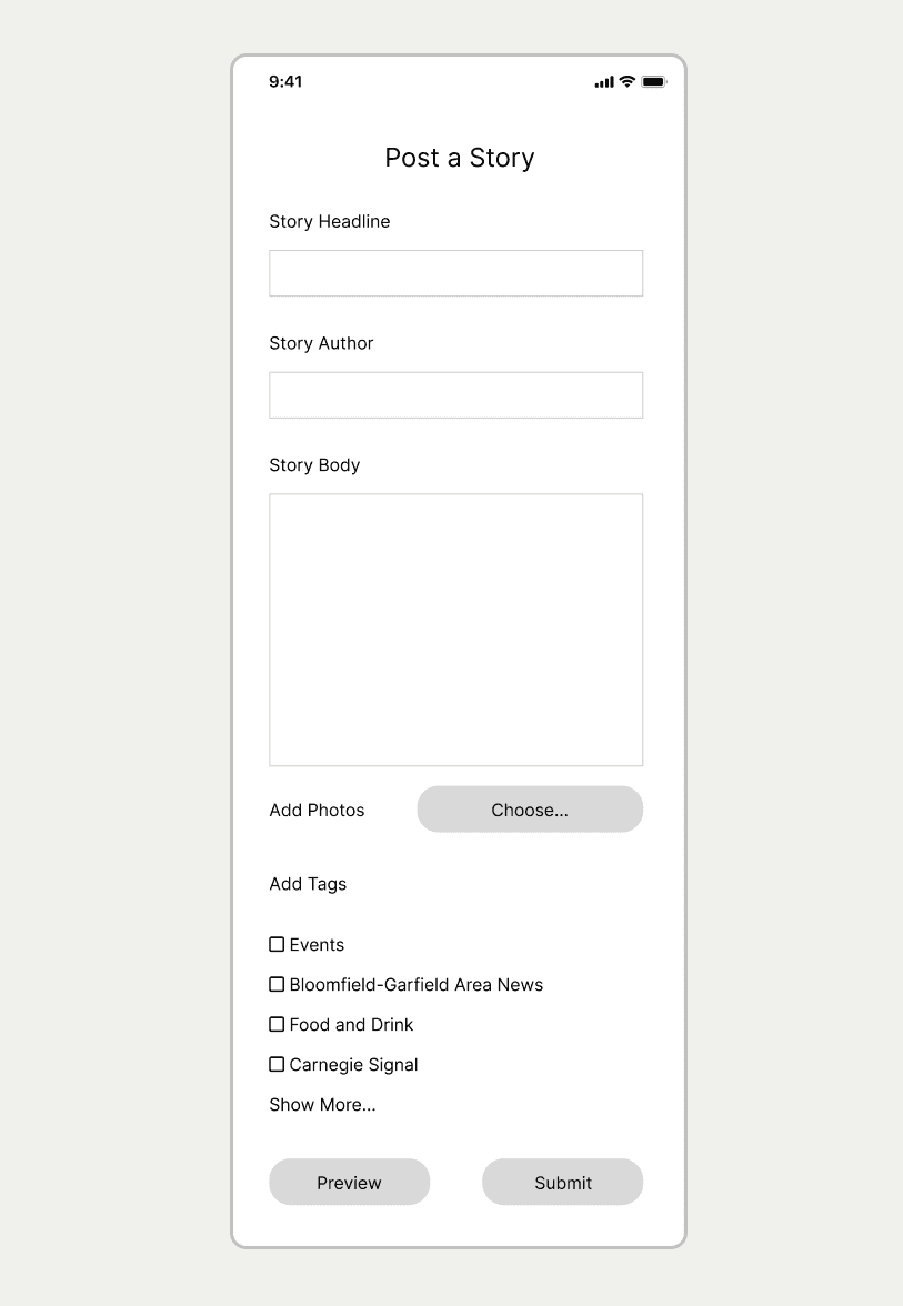
Add "posting prompts" in feed
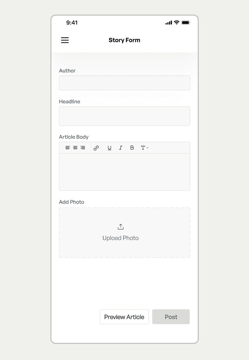
Condense form on "write article" page
Build
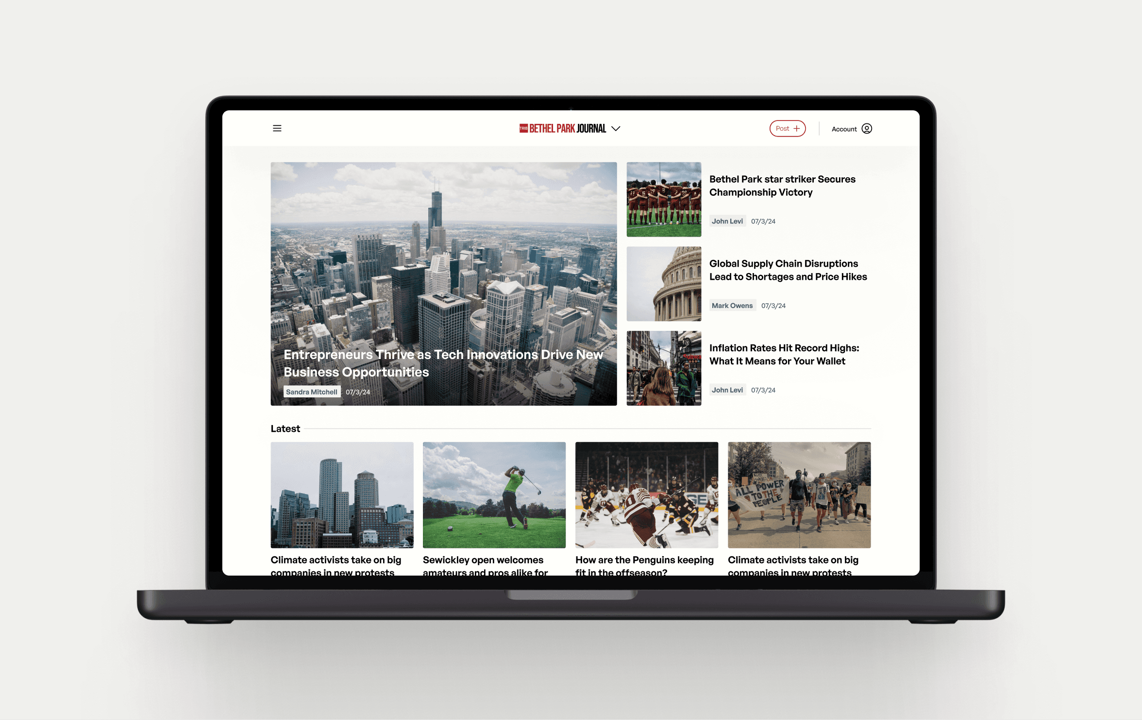
After working closely with developers I was really happy with how the final product came out. Throughout the next couple months we continued to test and bug fix to make sure the site ran smoothly.


Learnings
Know when to move on
We wasted a lot of time testing and rethinking potential solutions that we should have already ruled out and moved on from. An example of this is we tried to reinvent an article pop-up feature even after we tested and received feedback that users found pop-ups very disruptive.
Turn Presentations into Conversations
Begin with conversations to better understand direction and needs. This approach is much less intimidating than presentations and encourages a lot more feedback.
Collaboration is key
Working with developers was a major part of this project. After we ran into some obstacles caused by miscommunication, I learned to keep them involved in every bit of the decision making.
Focused Reiteration
Try to condense reiteration to focused pieces, rather than whole pages or concepts. This way its easier to see if the changes worked.